
Dashboarding transforms scattered data into actionable insights, enabling companies to identify bottlenecks, improve efficiency, and make informed decisions in their Software Development Life Cycle. By visualizing metrics like commits per PR, time to merge, and lines of code, teams can enhance performance and streamline processes.
Today, the most valuable asset to any company is data. Every company generates troves of data internally related to their products or services daily. This data is scattered across various sources. Learning from data is essential for deciding strategies, staying ahead of competition, improving the product development cycle, and increasing efficiency in delivering products to the market. Data can truly shape the future of any company if analyzed properly.
This post will describe how to make sense of the data that is present in every software company and visualize it. Furthermore, this will help companies make decisions to bridge the gap in their Software Development Life Cycle.
What Is Dashboarding?
I'm not sure if "Dashboarding" is a legitimate term or not (haha!), but it sounds good, so I’m using it. Dashboarding is a process to create dashboards containing multiple graphs from data scraped from multiple sources. This means turning numbers into graphs, such as pie charts, bar graphs, etc.
Numbers are good, but graphs are better to visualize the trend that a company is following over time. Graphs give a clearer view of what's been going well and which areas need improvement. This helps management decide the strategies that will bridge the gap of areas needing attention.
What Data Can Be Captured, and What Will You Get Out of it?
The possibilities of what can be captured as useful data and the sense that can be made of it are nearly endless. However, for any software company, data related to the source code is vital, like how big their codebase is getting, how much time it’s taking to merge changes to the master branch, and how big changes are going in the master branch. These are just a few examples that are common to everyone.
The following section contains the data points that Harness is scraping from multiple sources and creating graphs from. This data helped various teams see what they did well and what needed attention for more efficient delivery.
What Data Can Be Scraped?
There are various places where data related to your software life cycle can be captured and analyzed. The following are examples of these areas where data can be scraped and used to create visualizations.
Source Code Management
Every software company has a codebase, and a SCM is essential for managing it efficiently. SCM examples are GitHub, Gerrit, GitLab, or Bitbucket. The following metrics can be captured and, if analyzed properly, can ease the blockers when releasing software to the customers and bridging the existing gaps in SDLC.
Commits Per PR:
A Pull Request (PR) should always have the minimum possible number of commits within it. More commits into a single PR means more rework or refactor was done, and the same PR consumed resources to get verified multiple times. This shouldn’t become a habit or pattern in any company, as the costs can increase drastically.
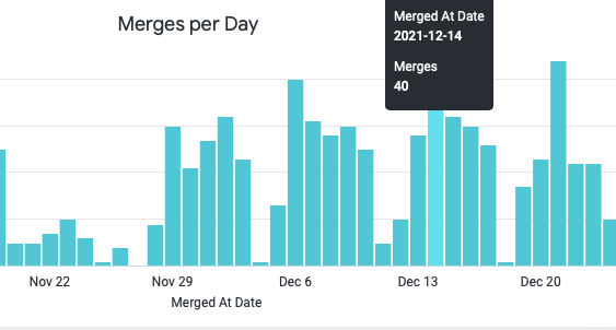
Time To Merge:
Releasing frequency has increased exponentially from once every few months to at least twice a week. Bug fixes or features must be merged, verified, and released to the customer swiftly. If TTM is going up, then you must look into what step is causing it to go up. For example, is there resource crunch to verify PRs, or is there any kind of approval delay, etc.

Number of PRs:
This metric can be used to track a team or individual’s contribution to a codebase at any point in time.
Lines Of Code:
This is a very important metric to track. As we progress with the codebase with new features, lines of code will increase overtime. However, if your lines of code are increasing even with fewer new features getting released, then this needs attention. Furthermore, more lines of code means more compilation time, higher vulnerability to getting bugged, and it can indicate inefficient code being written.

Force Merges:
Force merging a PR can give unwanted results, and it can even break your entire production branch. Therefore, if we analyze why force merges happened in the past (flakiness is the most common reason), then we can correct our merging process and reduce the number of force merges to zero.

Number of Branches and Tags:
This is optional, but it can be useful in some cases to track your release branches or release tags in your codebase. It can also be used to collect branches which are very old and no longer in use, thereby keeping your codebase nice and clean.
Project Tracking Systems:
Jira is the most common tool to track any project, and it provides many dashboards for visualization. However, those are through their own method, and they may not be useful for everyone using it. The following metric can be scraped, customized as per your need, and used to visualize the progress of every team.
Ticket Status:
Every bug or feature corresponds to one ticket or multiple tickets in Jira. Teams working in sprints efficiently raise tickets for their tasks for tracking purposes. You can pull data, such as how many tickets are closed and how many are opened, along with the duration. This gives an estimate of the velocity of any team working in the project, or easily finds if there is a pending ticket that needs attention. Moreover, this gives you an estimate of the investment that every individual is providing.

CI System:
This is the place where all of the code is vetted before merging to the main or QA branch. Therefore, analyzing parameters, such as how much time each job is taking, as well as the number of successful and failed jobs, can help when deciding future strategies for improvement if any gaps are found.

How Will You Get All of This Info to Create Dashboards?
To design such a system, you need knowledge of APIs, a programming (Java) or scripting language (Python), database (SQL, NoSQL, or Elasticsearch), and a choice of tool to create the dashboards (Kibana, Grafana, or Looker).
I prefer Python, because of its ease of use and large number of frameworks in the market to get the data via APIs from various sources, parse the data into JSON or YAML formats, and send data to various databases. Once the data is in the database, then, depending on the tool, you can use data accordingly to create dashboards. cloc is one of the tools present in Github to count lines of code in any repository.
What Are the Benefits of Dashboarding or Visualization?
There are no specific end benefits to this. Learning from your own data always helps improve efficiency in existing processes. That being said, the following are some of the general benefits of visualization:
1. All software-related information held at a single place from multiple sources.
2. Clear insight into internal team performance and development efforts.
3. Continuous improvement on process/products/services.
4. Insights about deployment frequency, both internal and from production.
5. Code and coding quality.
6. Upper management decisions/planning efforts.
The best part of dashboarding is that you can develop dashboards that are specific to your needs. Since this will be an in-house development, you really don't need to share data with any third party companies, and so you can have full control over KI (Key Information).
Conclusion
Data Visualization or Dashboarding helps to identify the bottlenecks in the software development life cycle continuously. Furthermore, this helps management decision making and allocates efforts in the right place at the right time. Dashboarding can give clear insights about how a business is running and can be improved. It can also help decide benchmarks for various projects, teams, and individuals.
We hope you found this article helpful and that it helps kickstart your dashboarding efforts. Interested in learning more? Look at our Custom Dashboards tool!

All this author’s posts
:: Always implementing simple solutions to solve not so simple tasks:: ::Current Holder of B1/B2 USA Visa | 10+ Years Advanced DevOps, AIOps, Platform Engineering, Security & Compliance:: 1. Orchestrating end-to-end release workflows for Docker, Kubernetes, and microservices, with integrated image scanning, SBOM, and security automation. 2. Leading platform engineering by building and maintaining IaC-based cloud environments with Terraform, plus scalable Kubernetes clusters using Helm and unified manifests. 3. Optimizing cloud costs with TTL policies, autoscaling, and insightful cloud cost dashboards for proactive resource and financial management. 4. Enhancing CI/CD with smart PR checks, branch protections, GitOps, and dynamically triggered selective pipeline runs to boost reliability and reduce build times. 5. Managing Bazel builds, macros, dependencies, and Python automation to accelerate releases while ensuring code quality at scale. 6. Embedding security everywhere: automating compliance, vulnerability scans, policy enforcement, and secure development practices into every step. 7. Driving AI/ML platforms using Python for AIOps: building tools for automated root cause analysis, incident response, and continuous improvement. 8. Constructing and maintaining enterprise-scale RAG pipelines to enable AI-powered document/codebase querying for rapid onboarding and support. 9. Powering developer productivity with advanced GitHub Copilot, custom prompt engineering, and agentic workflows for real-time developer support and quality feedback. 10. Championing “Everything-as-Code” for auditability, transparency, and thorough documentation across platform, infra, and app domains. 11. Ensuring audit readiness by aligning systems/processes with ISMS, SOC, and GRC standards, plus creating and refining evidence collections for compliance. 12. Automating security monitoring to quickly detect vulnerabilities, track risks, and provide actionable dashboards for strategic leadership. 13. Consistently leveraging feedback to optimize security, compliance, and quality, delivering sustained value to both engineering teams and business leaders.