
Harness developed a scalable tooltip framework enabling the documentation team to manage tooltips independently, reducing developer overhead and enhancing user experience with over 1.5K tooltips implemented.
Adding and managing tooltips can be a nightmare for developers and documentation engineers. Here at Harness, we designed a framework that enables the documentation team to add tooltips on the fly, with little to no developer interference.
If you are also trying to solve a similar problem, then read through this blog to understand our success journey!
Why Tooltips?
Modern-day self-reliable products should require minimal handholding. Complex forms become much easier to use if they communicate to the user what the form is expecting.
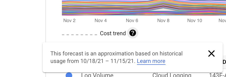
Look at some of the examples of tooltips usage from the GCP cloud console dashboard. Tooltips provide sufficient information to the user about different fields. They also provide <Learn more> links for detailed information.

The Challenges
For a UI engineer, there are millions of libraries that let you add these help texts to your web application. This works well if you have a small application and only a few forms with which to interact.
In an organization like Harness with multiple products and thousands of forms with multiple fields, maintaining tooltips can be a real overhead for the engineers:
- The content can change repeatedly.
- This can affect the unit and integration test snapshots.
We figured out early on that we need a scalable solution for our needs, and that the ask was clear: the tooltips should be maintained by the documentation team with as little developer intervention as possible. The following are some of the options that we tried:
- react-tooltip(https://www.npmjs.com/package/react-tooltip) was considered, but it was only solving a subset of our asks.
- Mutate the DOM on the hover of a field, and then display the tooltips from the source. This was rejected due to being unsafe, and it was difficult to implement and maintain.
Based on our findings, we decided on the following action items:
- The documentation team should have a separate repository to maintain the tooltips.
- The above repository would handshake with the core UI repository to display the tooltips.
- Attributes such as height, width, color, etc. of the content should also be customizable.
- Any modifications to the field in styles or labels should not affect the tied tooltip.
- The tooltips should not mutate/affect the original form fields.
What Did This Mean for the Developers?
After analyzing how some tooltip libraries already work, we figured it was imperative to identify each DOM node uniquely. If all of the node elements in a web page can be identified with a unique ID, then we can map the content against these IDs.
Look at some of the following snapshots from Harness’ deployments overview page.

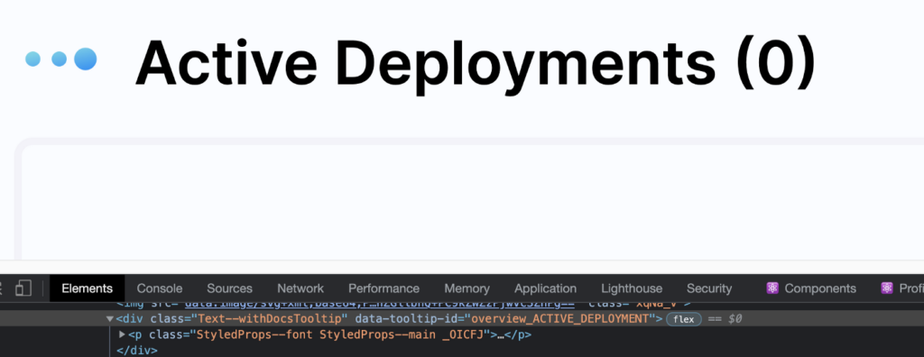
Here, the attribute “data-tooltip-id” is the key player. The developers must add this attribute to all of the HTML elements that should potentially have tooltip content.
What Did This Mean for the Documentation Team?
The next challenge was to provide a framework to the documentation team to manage the tooltip content against this ID. We created a Tooltip Editor to solve this.
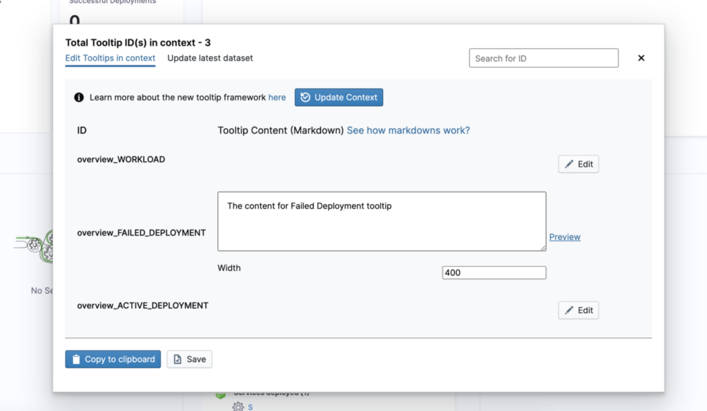
But how does the tooltip editor work?
The editor scans the existing DOM and lists all of the nodes that have "data-tooltip-id" present in them. In this case, we can see "overview_FAILED_DEPLOYMENT" and "overview_ACTIVE_DEPLOYMENT" being listed.
The documentation engineer will simply open this editor, add the content against the IDs, and then copy the latest dataset. We expect the content to be in markdown, so that it supports all of the standard formatting that modern browsers have. We also have the support for the custom ‘width’ of a tooltip, so that working with fixed-size images becomes easy.
Next Steps?
Once the content has been added and edited, the entire dataset is copied in a YAML format. This updated dataset is then copied and merged in the dictionary that resides in the tooltip-repo.
At Harness, we decided to use the YAML format after several discussions, as it is easy to use and work with. Other formats, such as JSON, can also be considered.
Publishing and Rendering of the Tooltips
As soon as the PR is merged, we run our own CI and generate an npm package for the same repo. This package, when installed in the main repo, has the latest dataset, which essentially is a map of tooltip-ids to content.
Then comes the rendering part, which is actually quite simple. We leverage the powerful feature of the React context to create a `TooltipContextProvider` and pass the latest dataset to it.


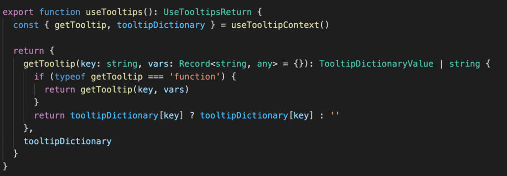
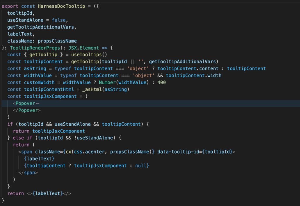
This integration works seamlessly. As long as we have the data-tooltip-id present, that field can easily have a help text next to it. Moreover, even if the content changes multiple times, the functional teams won’t carry the burden for it.
How Does Harness Benefit from Using the Power of This Tooltip Framework?
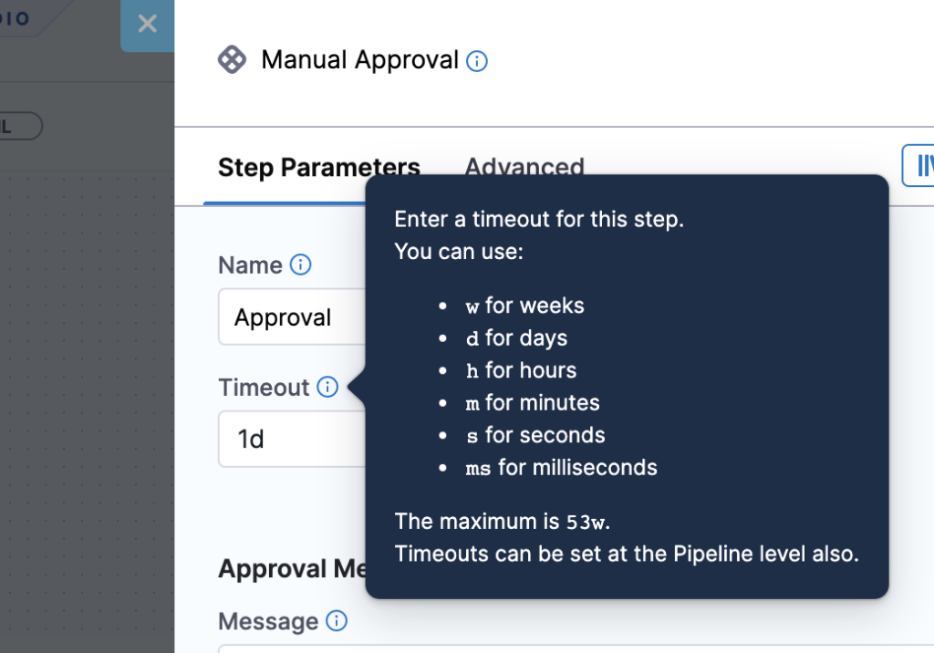
We’ve already added approximately 1.5K tooltips using this framework, and the list will continue increasing as we ship more and more.
Here are some snippets of nicely formatted Harness tooltips :)

Conclusion
Innovation is a key part of the Harness UI team, and we try to build as much in-house as possible. This framework is a perfect example, as we used our own CI to publish, build, and release the package. To read more about CI, please see Introducing Harness CI Enterprise.
Happy tooltipping :)
-Chirag
